Monday, March 29, 2010

Artist Blog: Nathan Schroder

(posted in May from saved draft)

Nathan Schroder is a Photographer from Dallas, Texas who began his interest in the medium at a young age. It wasn't until he left school, though, that he started to take elements from his influences to infuse his work. With more time to spend shaping his vision, technical skills and image creation skills, he began to develop a full understanding of his interest as a Photographer.

Shooting both in the studio and on location, Schroder draws much of his influence from the space around him, sometimes creating an image based solely on a location. For his commissioned pieces, he states the first and most important step it to ask the client their vision for the project, and then to build a story around it. He creates his images, "as a way of telling stories and conveying ideas." He also stresses the importance of keeping his clients feeling confident that their project is understood and in good hands.

Candles, Nathan Schroder, 2008. size unknown. http://www.nathanshroder.com.

Nathan Schroder's philosophy is that Photography is 75 percent preproduction, 10 percent shooting and 15 percent post-production. So far with the work that I do, that's certainly true. However, after further investigating, I found he has a lot of terrible cliches on his website (ie. "The way he sets up a photograph to tell a story - to capture its essence - turns an empty parking lot into an elegant spacescape.") Capture its essence and spacescape? I hope someone else wrote that for him. I don't know how seriously I should be taking him as a conceptual artist, but he's got some great advertising images!

Prairie Vodka Advertising Series:
Wolves, Nathan Schroder, 2008. size unknown. Commissioned advertisement for Prairie Vodka. http://www.nathanshroder.com.

Schroder's Prairie Vodka advertisement series was one of my favorite portfolios on his website. The ad agency OLSON created the vodka's first-ever print campaign with the slogan "Let the Prarie In", and hired Nathan Schroder as their photographer. He was to create print ads of polished models in an elegant setting next to stuffed animals that represent the prairie.
The agency stated that,"when you explain the concept, models and stuffed animals, it can come across as a little corny, but Nathan got it right away and in fact had done some shots featuring taxidermy. He brought the sophistication and drama that we were looking for."

Bison, Nathan Schroder, 2008. size unknown. Commissioned advertisement for Prairie Vodka. http://www.nathanshroder.com.

I guess the real reason I chose to research this artist was to recognize the technical perfections of his sets. I think he has an amazing grasp on scene setting, and his lighting skills are the perfect mix of dramatic low light and well exposed image. I need to learn from him.

http://www.nathanschroder.com/
http://www.commarts.com/fresh/nathan-schroder.html

Friday, March 26, 2010

Contest Blog! - Anderson Gallery

(Posted in May from saved draft)

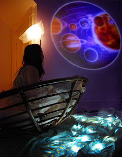
I entered the Anderson Gallery's 2010 Juried Student Fine Arts Exhibition!

I entered these 3 images:


Proof of entries:
(I only got two back because one got in!!)


Yep, that's about it. The Projection one was the one accepted!

Monday, March 22, 2010

Artist Blog: Alexia Sinclair

(Posted in May from saved draft)

Alexia Sinclair is an Australian fine art photographer and digital artist. Her style is recognizable and her images are always visual narratives. By combining pictures from different locations around the world, Sinclair creates multilayered images of imaginary worlds that present subtle contemporary notions of beauty and fashion.

I've made it clear before that I like to be in full control of my shoots, and apparently Alexia Sinclair does as well. "Motivated by her love and devotion for all things intricate and unusual,...[Sinclair] approaches her creative production by filling all of the roles, from designing sets and props, to makeup and costumes." (http://alexissinclair.com/biography)

Agrippina - The Poisoness (AD 15-59), The Regal Twelve Series. Alexia Sinclair, 2007. 25x25 inches.http://alexiasinclair.com/the-regal-twelve.

It's Alexia Sinclair’s The Regal Twelve series that I'm particularly interested in. She has combined hundreds of photographic elements and illustrations to create these pieces in recognition of twelve female European monarchs from over a 2,000 year span. Sinclair studied portraiture styles and the history of each of these varying rulers to stitch together certain elements and icons in order to present their story within each piece.


Isabella of Spain - The Catholic (1451 – 1504), The Regal Twelve Series. Alexia Sinclair, 2007. 25x25 inches. http://alexiasinclair.com/the-regal-twelve.

What I really like about The Regal Twelve is that it's a diverse series that recognizes the famous, the infamous and the unrecognized. It says on her website that Sinclair chose these twelve based on their leadership differences, on their "flamboyancies" and on their lasting influences on society. The article goes on to say that by "exploring the complexities of each ruler, The Regal Twelve celebrates historical realities within the guise of contemporary fantasy, a kind of conversation between the past and present."

I'm interested in what she does in post production. I'm trying to perfect my Photoshop skills and this is certainly what I try for. I love her imagery and narrative tone, of course. This was a great artist to stumble upon!

Christina of Sweden - The Androgynous Queen (1626 - 1689), The Regal Twelve Series. Alexia Sinclair, 2007. 25x25 inches. http://alexiasinclair.com/the-regal-twelve.

http://alexiasinclair.com/the-regal-twelve.

http://alexiasinclair.com/biography

Thursday, March 18, 2010

Artist Lecture #5: Megan Biddle 3/12/10

(posted in May from a saved draft)

Megan Biddle came to chat at VCU last Friday.

Megan Biddle is the fifth lecturer I've seen this semester, and I think she beat out Alec Soth as least liked. After getting a degree in glass from RISD, Biddle moved to New York City where she said she had a hard time making work. She eventually attended VCU and, after graduating, began to branch into other mediums.

This lecture was extremely informal. There were maybe 20 of us in a small critique room in the Craft department and 2 of her videos didn't even work. She showed a lot of different pieces, but very few coincided with the next on the slide. While there's nothing wrong with not having a series, I have a hard time being interested in each individual art object and installation when they lack continuity in terms of style or process (other than the concept of patterns). It was an interesting lecture to attend, however, because of how different it was. I think Fallon would agree.


Plumage, Megan Biddle. 2003. Blown glass and wire. 21"x4"x69" http://www.meganbiddle.com

Biddle's work was arguably "pretty" I like her usage of patterns, and how she uses the patterns of nature and their repeating quality to inform her work. By constructing installations like a room full of feathers and creating finger print stencils, she shows that although similar, there is still a uniqueness in each pattern. She said of the finger print stencil that she wanted to put more of herself in her work...in a very literal sense.

Untitled (Feather Room), Megan Biddle. 2003. Construction materials and feathers. 6'x6'x7'. http://www.meganbiddle.com

One project I found really fun and something I'd like to try was her salt crystals project. By creating salt baths and taking care of them each day, she grew salt crystals and created a beautiful forms out of them on plastic forms and wood.

She also shared with us her illustrations, like some indirectly drawn drawings. There were a lot of different things shown during her speaking time and it was a little too confusing and informal for my taste of lectures, but I'm still glad I went. I was actually in the Crafts department for a year, with glass as my focus, so it was nice to be back in there to look at an artist actively using that medium.

http://www.meganbiddle.com

Sunday, March 14, 2010

Artist Blog: Hieronymus Bosch

(Posted in May from saved draft)

Hieronymus Bosch was an Early Netherlandish painter who used fantastic imagery in his work to illustrate religious and moral ideals in a narrative approach. He lived from 1450-1516.

An example of one of his sketches:
The Tree Man. Hieronymus Bosch, 1470s. Pen and bistre on paper. Vienna, Austria. http://www.abcgallery.com/B/bosch/bosch.html.

I've spoken to Tom and my father (who's a painter) about this artist several times because I'm so encapsulated by the things I've seen in these paintings. It is so odd and interesting to find this artist with such vivid surrealist imagery from that time period, and the fact that it's associated to religion makes a lot of sense to me. My favorite part of going to Saint Gertrude High School was learning about all the strange stories in the Bible. I'm not a religious person by any means, so my belief lies on art, love and humanity. My most ritual and meditative state to reflect on life is when I'm making art, and I feel like maybe it was one of Bosch's religious rituals as well. I guess we'll never know.

There's so much information on Bosch that I'm making the focus of this post specifically on his piece Garden of Earthly Delights.

Garden of Earthly Delights (Triptych), Heironymus Bosch, c.1510. Oil on panel. (In the Museo del Prado, Madrid, Spain.) http://www.abcgallery.com/B/bosch/bosch.html.

Seen above, Garden of Earthly Delights, is among his most famous paintings, although its original title was never recovered. This triptych depicts 'Paradise' on the left panel (with Adam and Eve and many strange animals), the 'Earthly Delights' in the middle panel (with several nude figures and magnificent birds and foods), and 'Hell' on the right panel (with illustrations sinners experiencing extravagant punishments). The backs of the exterior panels are painted so that when you close them you see a God creating the Earth.

Bosch's remarkable ability to create and build this extremely intricate landscape encourages me to keep building my own landscapes for my shoots with more detail. With over a thousand figures depicted in this piece, he uses a series of exaggerations and distortions to make his subjects fantastical. I plan to do this in post production in Photoshop, not to such extremes, but I guess it's the modern day fantastical approach.

There's a lot of incentive to start creating multi-fantastical sets now, so get ready to see some progress!

http://www.abcgallery.com/B/bosch/bosch.html
http://www.artchive.com/artchive/B/bosch.html

Thursday, March 11, 2010

Artist Lecture #4: Sanford Biggers 3/11/10

(posted in May from a saved draft)

I’ll start out by saying that Sanford Biggers is a very complex artist, and while I liked the obvious involvedness of his work, it was hard to take notes at his lecture.


Sanford Biggers came to talk to us this week from his home in New York. With a culmination of sculpture, video, music and other media, Bigger’s work mixes African culture with hip-hop and pop culture in America. His complex pieces are made in heavily involved pr
ocesses, in order to communicate ideas of race, social standings of the past and black culture.

One of the first pieces we got to see was a break dance floor that he colored with a design. This piece has been displayed in galleries and danced on within the galleries as well. To comment on how a space becomes its own and how its treated, Biggers filmed dancers from above the tiled break dance floor and articulated how it was a sacred space to those dancers, like their own place for spirituality. I thought this was really awesome because I feel like I was talking about this in my post on H. Bosch!


Mandala of the B-Bodhisattva II, Sanford Biggers. Hand colored rubber tiles, 16x16 feet. http://www.sanfordbiggers.com

During the lecture, Biggers shared a video he made in collaboration with a white artist. Together they combined similar home movies of their families and created a whole different movie. It was an obvious comment that although they’re of different races, they’re n
o different from each other.


A Small World, Sanford Biggers, in collaboration with Jennifer Zackin. 6:30 minute silent color DVD. http://www.sanfordbiggers.com/


http://www.sanfordbiggers.com/

Monday, March 8, 2010

Artist Blog: Aino Kannisto

(Posted in May from saved draft)

Aino Kannisto is a Finnish photographer who constructs fictional scenes that she records with her camera. Kannisto, like me, acts acts as the subject in her scenes and doesn't consider them self-portraits in a traditional way, but considers herself a narrator. "My pictures are fantasies, I represent an atmosphere or a mood through fictional persons. Fantasy is a means to speak about emotions." - Kannisto (http://www.women2003.dk/artists.php?id=46)

She and I obviously speak the same language.


Untitled (Trashbin) Aino Kannisto, 1999. C-Print, Diasec, 90 x 115 cm. http://www.m-bochum.de/artist_image.php?aid=66#down.

Kannisto's influences are much like the influences of mine and previously posted artists, with emphasis on the surrounding world, literature and cinema, "as well as by images more difficult to locate, such as memories, daydreams and nightmares" (Kannisto). She also admits that just being alive, engaging and perceiving life and the things around her, ignites pictures in her head.

Being an artist as just a reaction of life is such a great definition of Artist. I think it's a breakthrough, even.

"I see pictures in my mind, the things I have dealt with come into my dreams and still moments. I cannot stop working as I cannot stop thinking or existing in the world." - Kannisto

Untitled (Translucent Curtain) Aino Kannisto, 2002. C-Print, Diasec, 90 x 113 cm. http://www.m-bochum.de/artist_image.php?aid=66#down.

I really love the softness and romance of her gesture in this above piece, Translucent Curtain.

Untitled (Blue River) Aino Kannisto, 2006. C-Print, Diasec, 90 x 142 cm. http://www.m-bochum.de/artist_image.php?aid=66#down.

Sometimes it's exhausting to find these artists. I find it frustrating that I'm only this age and that I haven't been in the world before now to know about these things before they did. Selfish, yes definitely, but it's true. I find so many similarities in the mindset and influences of these artists that help fuel my creative processes that I feel unoriginal again. But at the same time I feel the need to keep my work personal and quiet and only for myself because that's why I make it in the first place. It's a dilemma for me, but not for Kannisto, who said "Making pictures is for me a way to deal with human emotions. It is also a source of immense creative energy and pleasure – a way to give meaning to life by sharing some part of the world which otherwise remains private."

I hope eventually I share the same joy out of sharing myself and my work in the same way she does.

http://www.m-bochum.de/artist_image.php?aid=66#down.
http://www.women2003.dk/artists.php?id=4

Thursday, March 4, 2010

Research Blog: Mid Critique!

I had my mid-critique! It was incredibly uplifting and successful and I feel as though our class has really reached out for each other this semester and we're genuinely interested in each other's endeavors.

These were the two images I shared:

Enlightenment, Rebecca Arnold, 2010.

Voyage, Rebecca Arnold, 2010.

I received very constructive and supportive feedback from the class. A lot of comments were reassuring, about how I've really gone 'all out' (in a positive way) this semester and that my execution of childlike/dreamlike visions constructed in a mature way is successful. This is really uplifting! I'm so glad I'm finally heading in the right direction.

There were some disagreements over suggestions, like one over adding another layer in the photo "Voyage", so that you can't see the closet door in the background and so that I was completely entrapped by this fantasy world. The rebuttal was that presenting both the real world (what I'm escaping from) and the illusion (where I'm escaping) meeting so close together is successful. Another debatable item was the "boat" chair in that same photo. One classmate thought it was distracting, as it was recognizable and it's already obvious I'm in a domestic setting, but others argued that that's what makes it accessible.

I'm extremely happy with how this semester has gone so far in terms of production and progression. I can't wait to continue making these sets!

Monday, March 1, 2010

Artist Blog: Boyd Webb

(Posted in May from saved draft)

Boyd Webb is an artist who uses large scale cibachromes (which are now known as Ilfochromes thanks to
Ilford) in which his subjects and their environments are in the midst of an absurd occurrence. Webb was born in New Zealand in the 1940's, and after he turned 25 in 1972, he traveled to London to study at the Royal Collage of Art. Some of his exhibitions include the Hirschhorn Museum in 1990, Whitechapel Art Gallery in London in 1978 and 1987, and the Auckland Art Gallery touring exhibition in 1997. He now lives in Brighton, England but continues to travel.

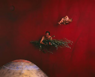
Coxswain, Boyd Webb, 63x75 inches, Archival Digital C Print, framed. http://www.artnet.com/artist/17598/boyd-webb.html


Another student suggested I look into Boyd Webb's work, and actually I remember him from my first Studio class at VCU. It was nice revisiting these images knowing what I know now. When I think back to that class when I was first introduced to his work, I liked it a lot and was very intrigued, but I couldn't really understand why. And my teacher (ahem) wasn't very good at speaking about him either, so that didn't help.

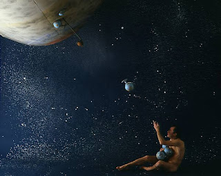
Bedding II, Boyd Webb, 63x75 inches, Archival Digital C Print, framed. http://www.artnet.com/artist/17598/boyd-webb.html


While I really like his work and find it relevant to my own, I feel like I'm trying to move away from this simplistic studio aesthetic. I want to have elements of domestic spaces in my photographs and added layers as well. I'd like to get back into doing studio work eventually, but not for this series.


Either way, I'm fascinated by his work and his utter control over his sets.


Tosser II, Boyd Webb, 63x75 inches, Archival Digital C Print, framed. http://www.artnet.com/artist/17598/boyd-webb.html


Without realizing, I see now that the three images I chose to share of his were all celestial/astronomical in style, which is actually what I've been working with lately with my own shoots (which I will show at mid-crit!). I probably also chose these because I tend to choose the most fantastical and whimsical images of my favored artists. So sue me.


http://www.suecrockford.com/artists/biography.asp?aid=15

http://www.artnet.com/artist/17598/boyd-webb.html